

🗺 these suck

So far in the 🟢 Start Here Series:
In Part One, we gave names to the sections of songs—verse, chorus, etc
In Part Two, we talked about our musical ruler of time: beats & bars.
In Part Three, we looked at our musical ruler for pitch: the major scale
Today we’re gonna tie all of these things together by discussing the nuts & bolts of writing music out on paper—how to create useful “charts.”
But first, let’s start with the obvious question…
Should you care about this?
It’s not just you.
For band & orchestra instruments, your only real chance to learn was to go through the official channels. You picked out an instrument in grade school, played through cheesy etudes in a book, and maybe you stuck with it long enough to be allowed to have fun.
They learned to read music because that’s the only way to learn the instrument.
Guitar ain’t like that at all.
We want the fun right now. We don’t want to play Hot Cross Buns, we want to play Hot For Teacher. And so we’ve invented ways to skip the boredom and get started playing cool songs we actually like:
TAB,
capos,
chord grids,
drop tuning,
backing tracks,
YouTube tutorials,
blues scale shapes,
lyric sheets with chords written above them.
There’s nothing wrong with any of these things!
But conspicuously absent from the “normal” way to learn guitar is any awareness of how guitar fits in with the broader world of songs & musicians. And my mission here is to convince you that your life gets much easier when you use the right tools.
your life gets much easier when you use the right tools.
For example:
I’m an American. My brain works in Fahrenheit, feet, and pounds. But I’m not a glutton for punishment. If I want to bake a loaf of bread or create a 5% saltwater brine for pork chops, I use the metric system. It’s the right tool for the job! It’s soooooooo much easier.
Charts are the right tool for some jobs.
You’re not wrong. We avoid written notation for good reasons: it tends to be fussy, inaccurate, and above all irrelevant to the types of music we like to make.
But that’s usually because…
Most charts suck
Charts have a specific job. We use them to:
make sense of a song
explain a song to someone else
remember a song in the future
We’ll revisit those, but the main takeaway here is this:
Charts are just notes to your future self. (And/or your bandmates.)
To that end, you can use whatever works best for you in your situation:
notation
TAB
Nashville number charts
simple text with the key & the form
But let’s clear something up about notation.
Charts ≠ Sheet Music
“Sheet music” is usually one of two things:
The very specific set of instructions given to an orchestra or pit band on how to play a composition, prepared by an expert.
A snake oil cash grab where a publisher sells embarrassingly crappy transcriptions of popular songs.
The orchestra example is pretty self-explanatory, and we’ve already established that you & I are on a different journey than orchestral players.
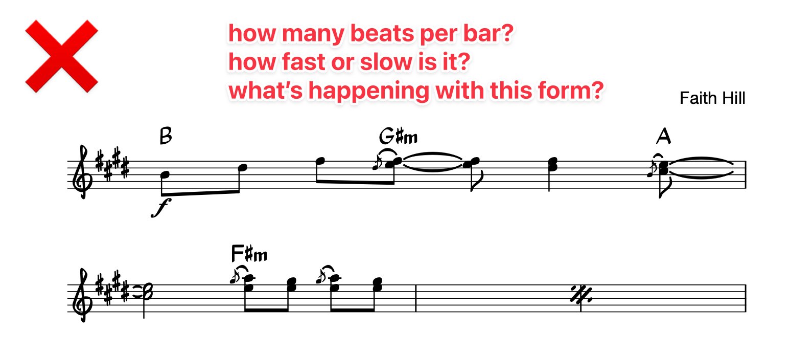
As for example #2, here’s some sheet music from MusicNotes.com:
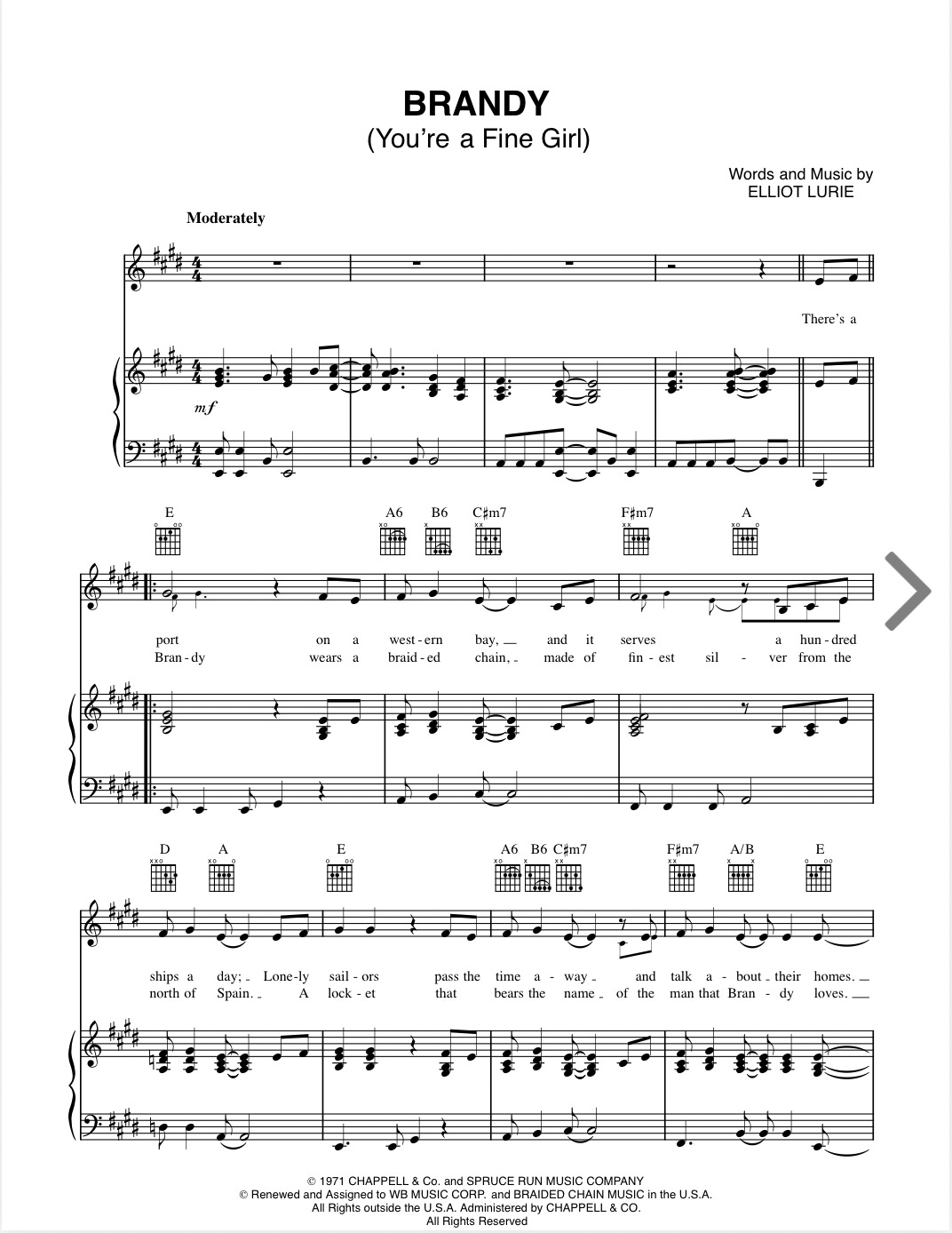
❌ The chords are wrong.
❌ The intro is missing four bars.
❌ “Moderately” isn’t a useful indication of the tempo.
❌ There are a few other terrible decisions and outright mistakes that jump out at me (and that we’ll discuss in a minute or two).
It’s not completely useless. But onstage or in rehearsal, this would be a disastrous shitshow. It’d require extensive surgery to be stage-worthy. It’s definitely not worth your $5.79 of hard-earned money.
Let’s contrast this “sheet music” with a “chart.”
All maps are wrong.
That’s a feature, not a bug.
A perfectly accurate map would be useless. (Not to mention a dangerous distraction from the world around you.) A good map makes the directions clear, then gets out of the way.
Charts are maps for music.
Charts (like maps) are a low-resolution mockup of the thing they represent. There’s way more detail in the music itself than there is in the chart. The chart is just instructions that’ll allow someone to reconstitute high-res music from a low-res “map.”
It starts with empathy.
To create a “low-resolution mockup” that’s actually useful, you’ll need to know what bits are crucial to the chart’s intended audience. Luckily, the intended audience is almost always:
future you
and/or your bandmates
I trust that you know these people well!
Let’s create a useful chart.
Where do we even start?
Oh wow, look at that:
It starts with the things we’ve covered in the Start Here series:
Make the beats-per-bar & bars-per-section legible at a glance.
If a chord can have two names, use the correct one for the key.
Write in any specific rhythm things that make or break the song.
There aren’t too many other things: tempo, dynamics, & any specific riffs or melodies.
Let’s take them one at a time.
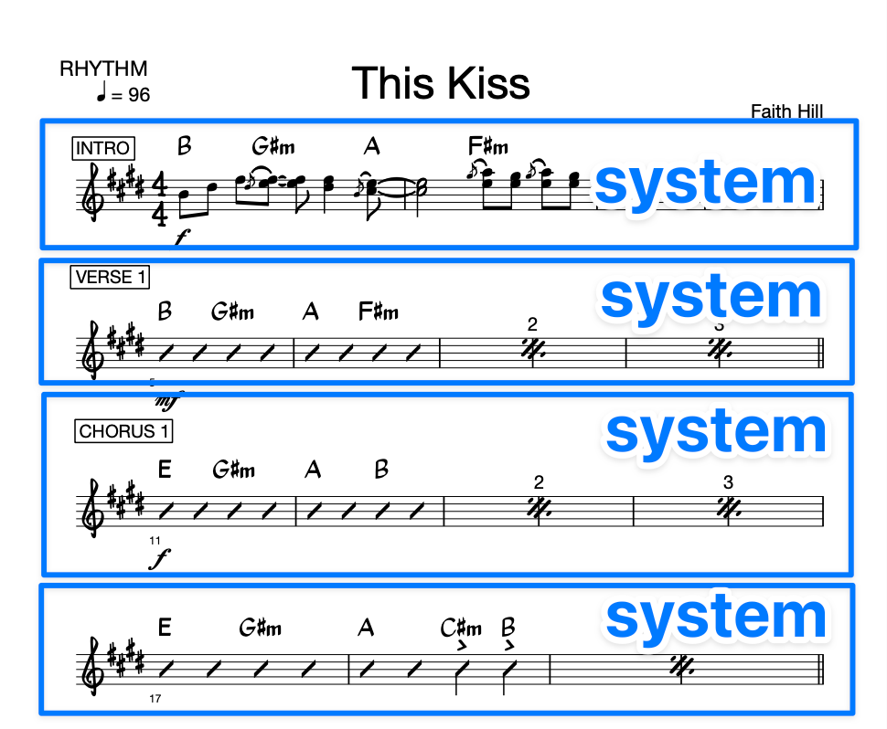
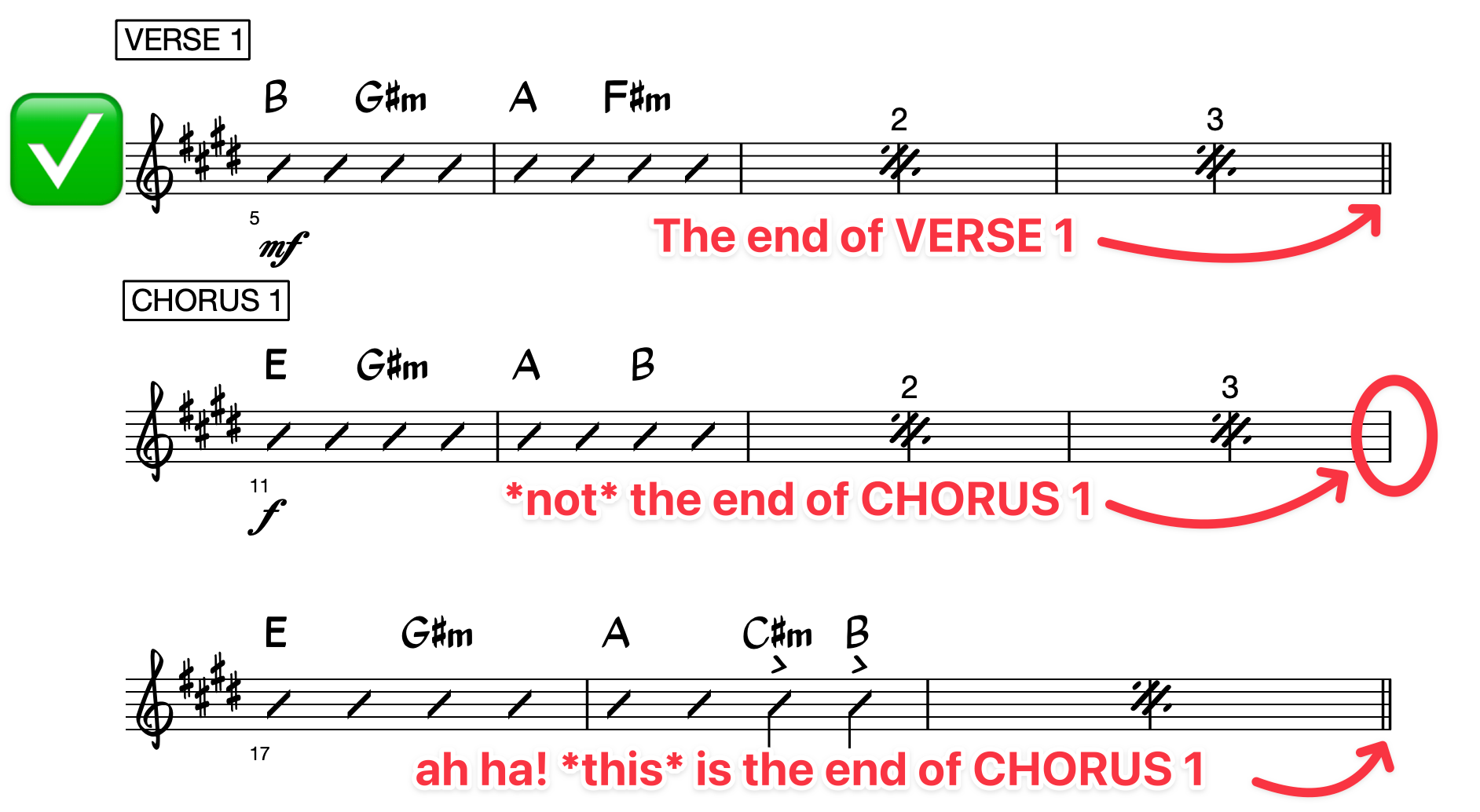
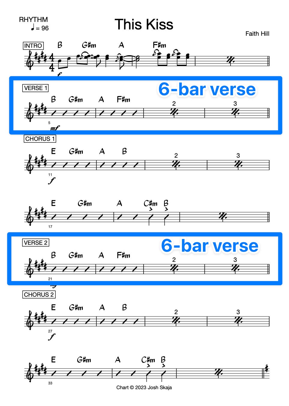
#1 - Label the sections.
We want to make the song’s form obvious.
New sections should start on a new “system.”
A “system” is analogous to a line break in text:
Then why don’t we just call them “lines” of music?
Because “line” was already taken—horn line, lead line, vocal line, etc.
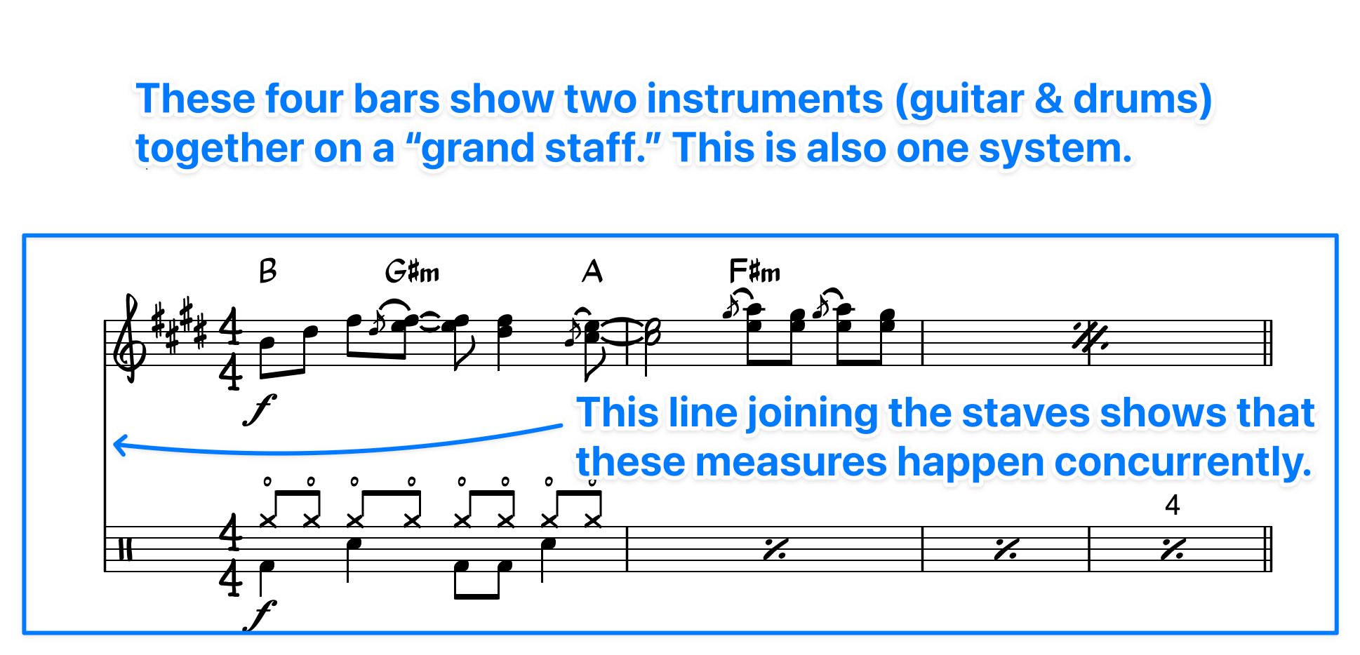
Systems create order!
If we just cram in as much music as we can fit, it’ll be hard to read:
A good chart uses system breaks to make the form obvious.
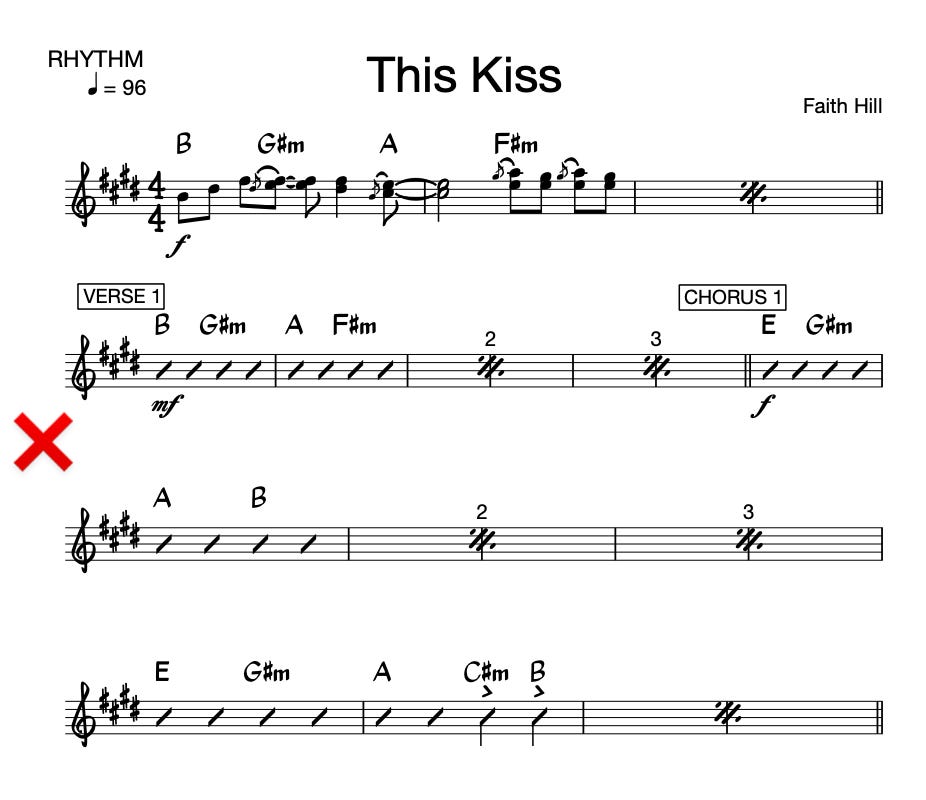
We use double bar lines to mark the ends of sections.
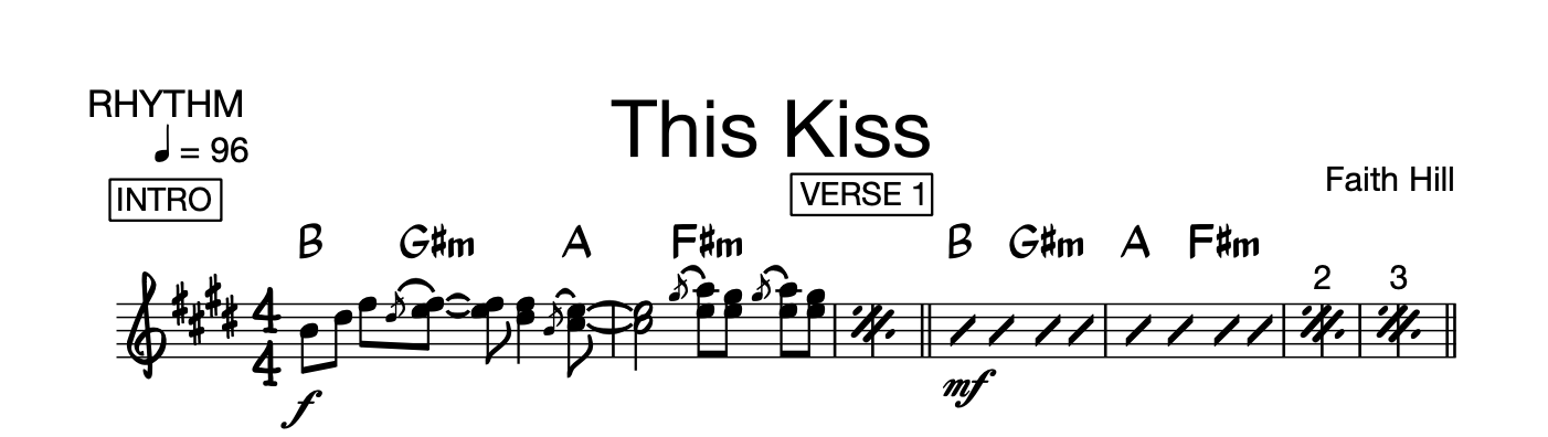
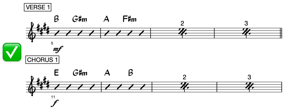
#2 - Show us the beats, bars, & tempo.
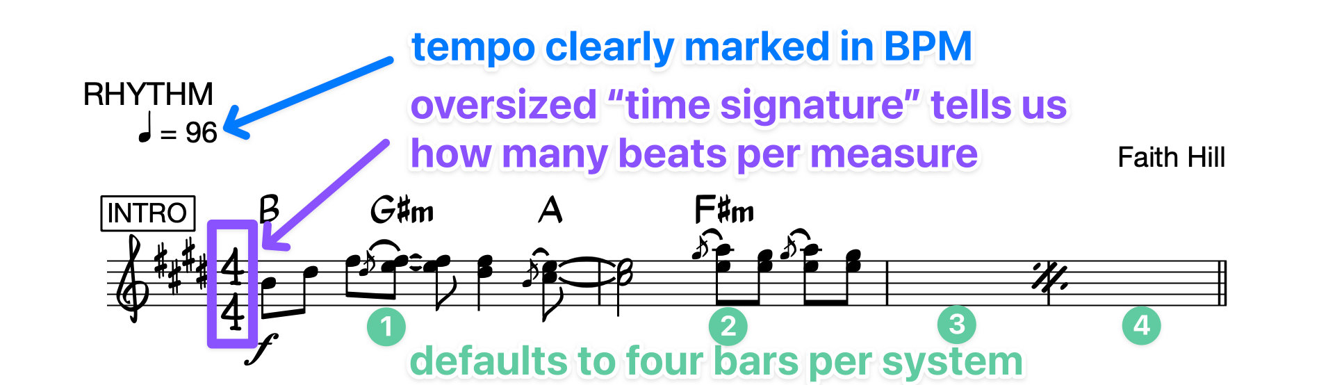
“Normal” songs operate in groups of 4 bars.
An intro is probably 4 bars. A verse is probably 8. A chorus might be 16.
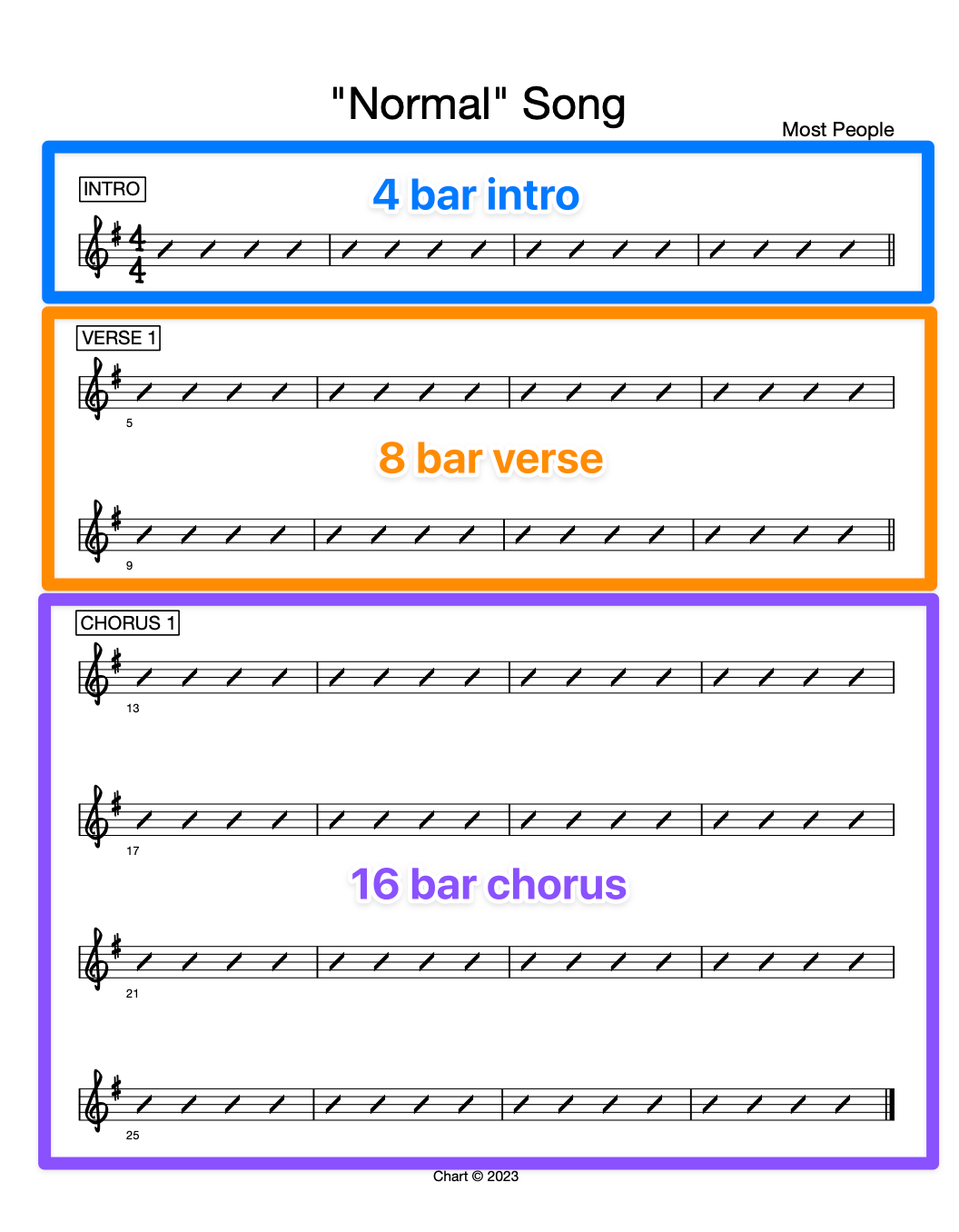
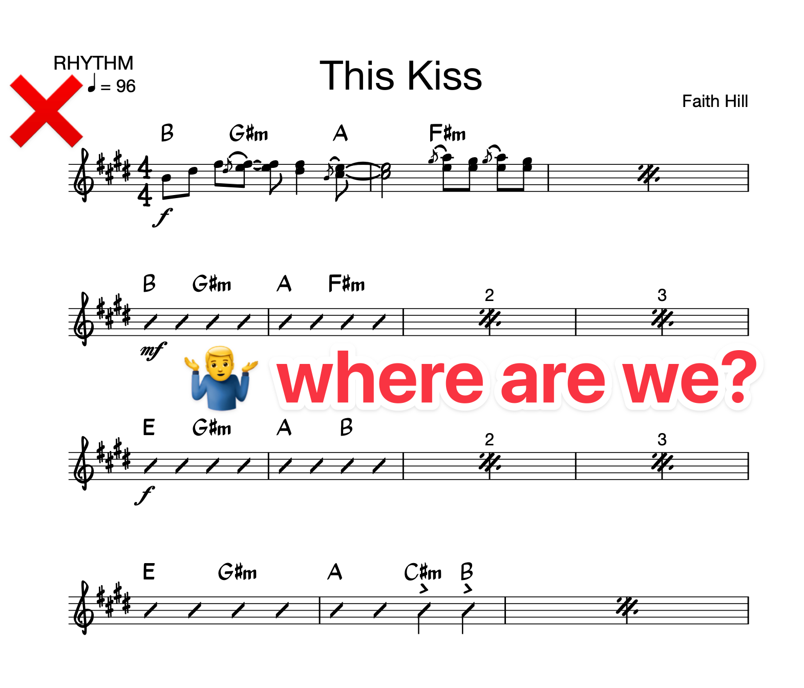
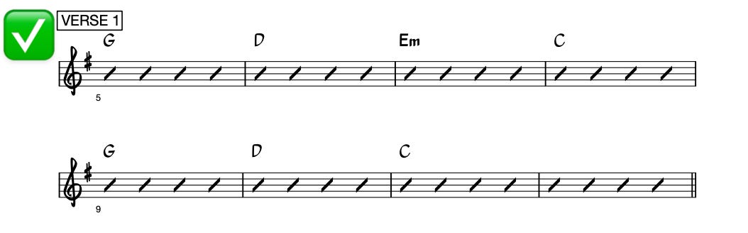
Your chart will be be more legible if you default to writing 4 bars in each system.
It’s visually intuitive & feels logical.
Watch what happens when we flout this convention:
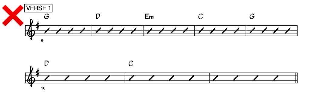
But of course, real music is often messier than this.
Sometimes a phrase or progression repeats itself after 5 bars. Or a there’s a section that’s 7 bars long. That’s cool! I love that stuff!
The reason we default to 4 bars per system is because that’s the default logic for how western songs are written. But if the song doesn’t follow that logic, the chart shouldn’t either.
The chart should follow the logic of the song.
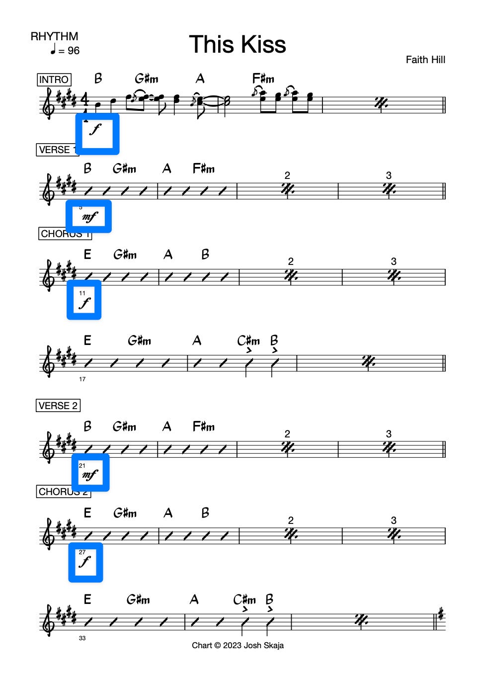
Let’s talk about dynamics.
Along with key, tempo, & form, your chart probably needs dynamic markings.
We write these in Italian:
f = forte = loud
p = piano = quiet
The default dynamic is mf or “mezzoforte,” aka “medium loud.”
There’s also a medium quiet (mezzopiano) - mp.
To get louder than loud, you can use ff or even fff.
To get quieter than quiet, you can use pp or ppp.
A good starting point for dynamics:
verses are mf
choruses are f
maybe the last chorus or outro hits ff
and maybe for the breakdown it gets mp
A couple other thoughts on dynamics:
a band that doesn’t use dynamics = a crappy band
your band is gonna be as loud or quiet as your drummer
so whatever chart the drummer is using should have dynamics marked clearly
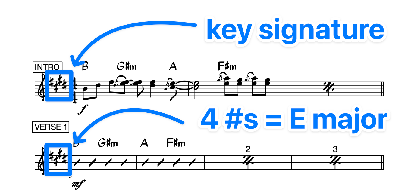
#3 - Tell us what key it’s in.
Which means first you have to figure out what key it’s in.
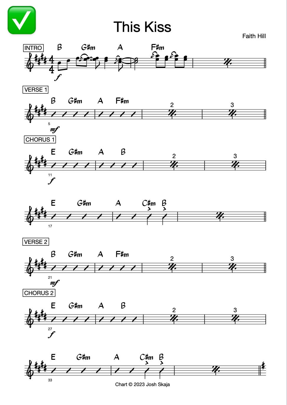
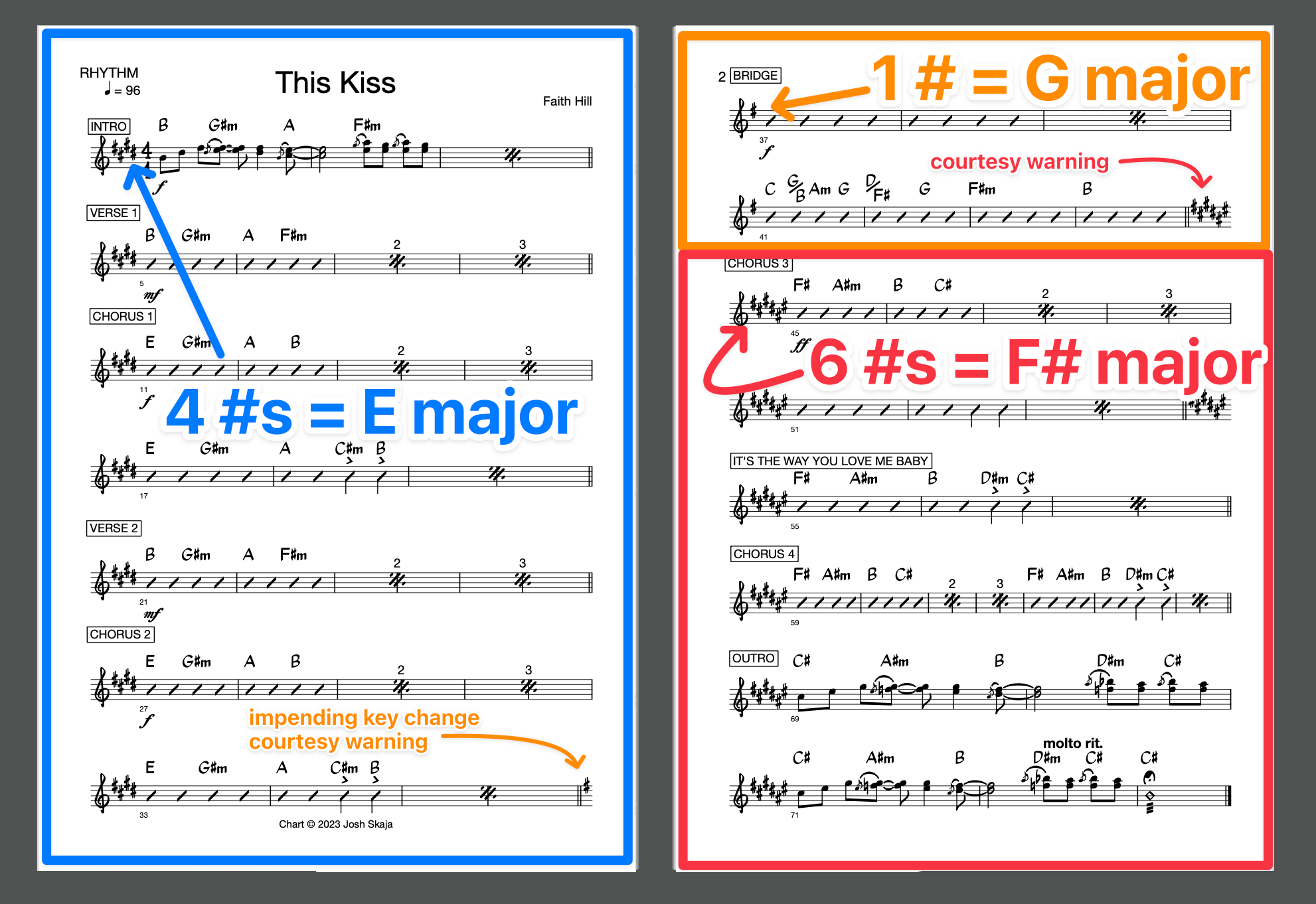
If I had to guess, I’d say 75% of pop songs start on the I chord. This Kiss starts on a B chord, so maybe it’s in the key of B?
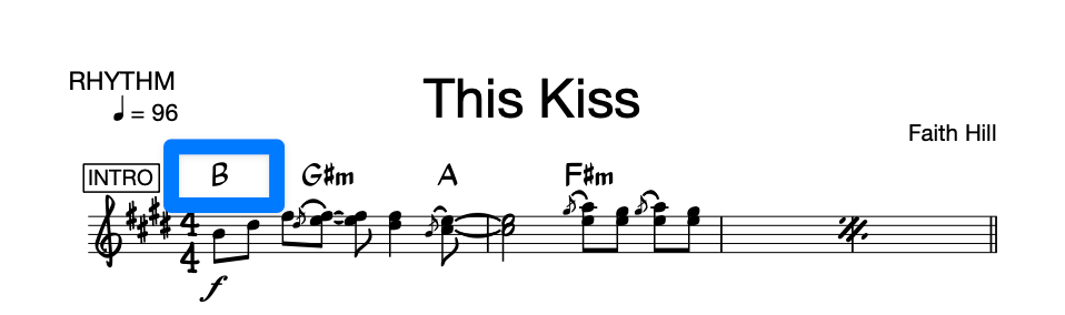
But if we zoom out a little…
…we see that these are the chords:
E
F#m
G#m
A
B
C#m
Pretty obviously, those chords all come from the key of E:
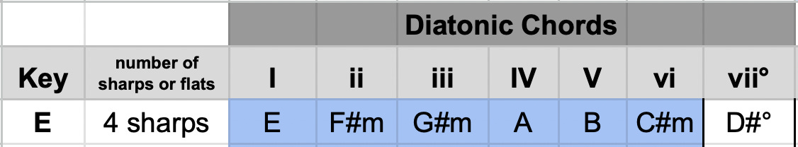
Ok, so we know it’s in the key of E.
When we write the key on a chart, we don’t write “E” or “A” or “B♭.”
Instead, we write a “key signature” at the beginning of every system. The key signature is:
a specific number of sharps or flats…
…that we write in between the treble clef (𝄞) & the time signature (4/4):
This is the nerdiest secret-decoder-ring part of this whole series.
It can take a while to memorize all these…
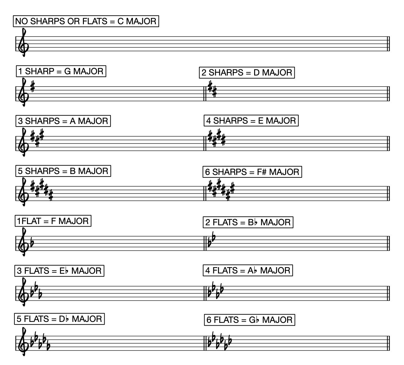
…but some other time I’ll write up an easy way to remember them all.
One of the reasons I picked This Kiss as an example is the key changes:
#4 & #5 - Chord names
Again, we start with empathy.
Make life easy for the person reading the chart.
Once more for the people in the back: make life easy for the person reading the chart. Choose the shorter, easier chord name unless you have a good reason not to.
I mention this specifically because Berklee insists on writing:
Emi7(9) instead of Em9
C7(9) where everyone else writes C9
G7(9,13) where any sane person would simply write G13
Not only is the Berklee way not standard outside their halls, I can’t even get Sibelius to render chord symbols this way. (I’m sure there’s a workaround, but the fact that it even requires a workaround is enough proof that it’s not a great idea.)
Choose the chord name from the key you’re in.
We guitarists are particularly bad at this. Because most of us don’t come from a more “proper” music education background, we tend to call chords by their wrong names.
For example, we might write Baba O’Riley like this:
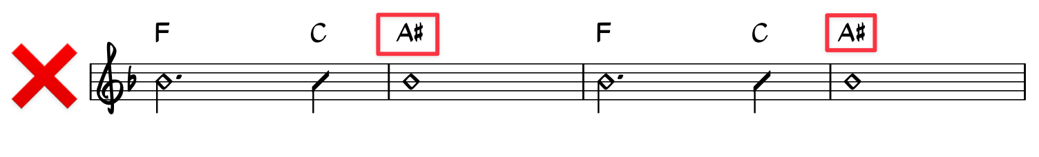
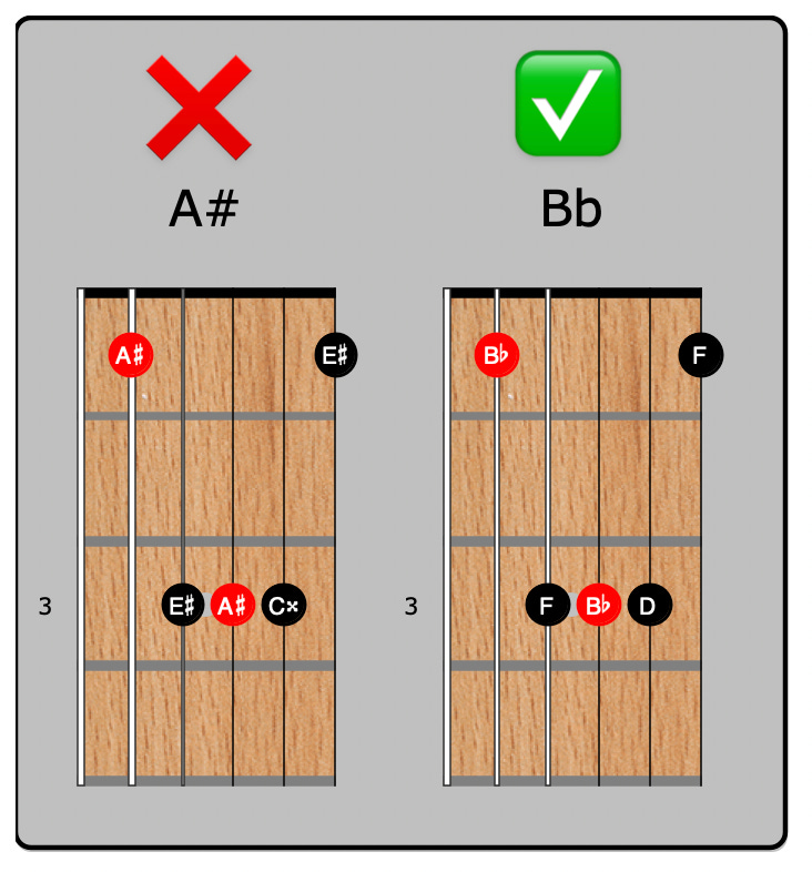
But there is no A# chord in the key of F:
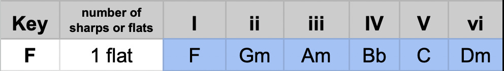
In the key of F, that chord is called “B♭.”
Same exact notes, different names:
There are reasons for this!
The reasons are too pedantic and tedious to unpack here. So let’s skip that and instead show you how to easily get it right:
👉 Each letter only happens once in each key:
❌ F G A A♯ C D E F
✅ F G A B♭ C D E F
It’s too easy to confuse A♯ with A. Much easier to use B♭.
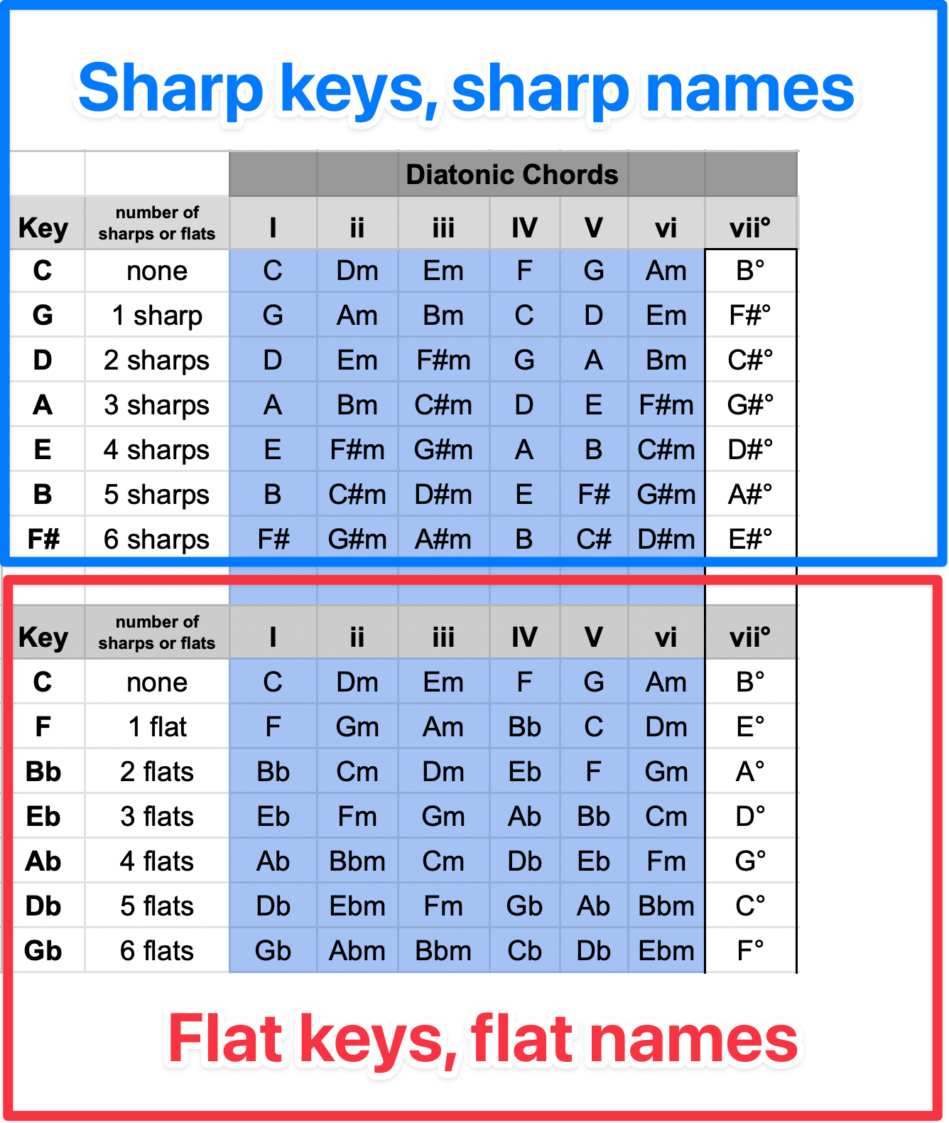
👉 For sharp keys, use sharp names. For flat keys, use flat names.
👉 Are there any exceptions? Yes… the “flat” chords!
Again, there are nerdy, pedantic edge cases where we might encounter further exceptions, but you can get it right in 99% of cases by following:
each letter only happens once per key
use sharp names in sharp keys
use flat names in flat keys
and flat names for the ♭III, ♭VI, & ♭VII…
(but even that only really happens a handful of times)
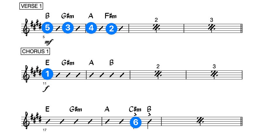
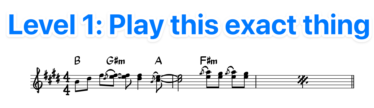
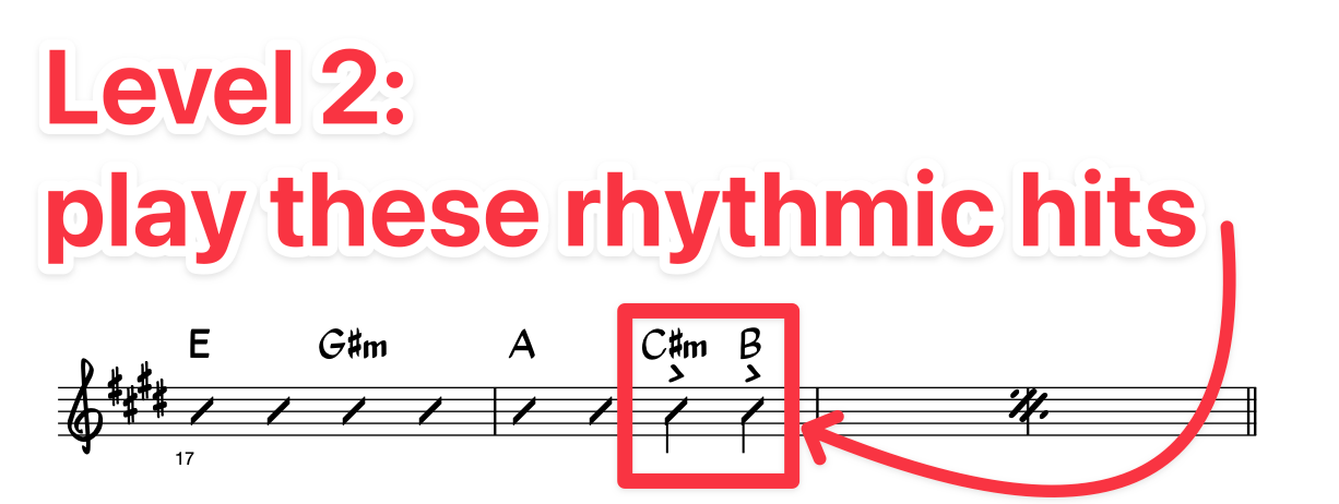
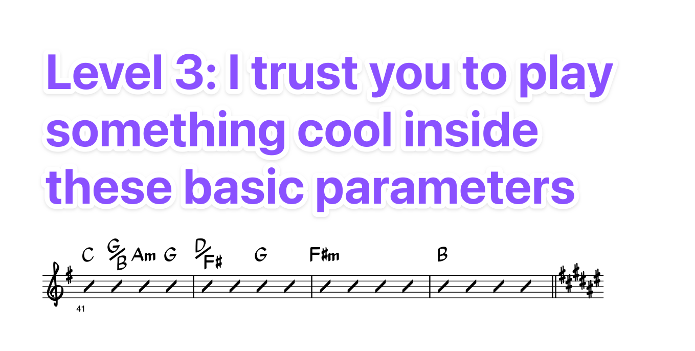
#6 - Show important rhythms (then get out of the way)
Good charts operate on three levels of detail.
From most- to least-detailed:
“I need you to play this specific melody or riff.”
“Play this chord with this rhythm (but I’ll leave the voicing up to you).”
“Play something stylistically appropriate around this chord.”
We can see all three levels at work in This Kiss:
So much bad charting comes from failing to understand when to use which level.
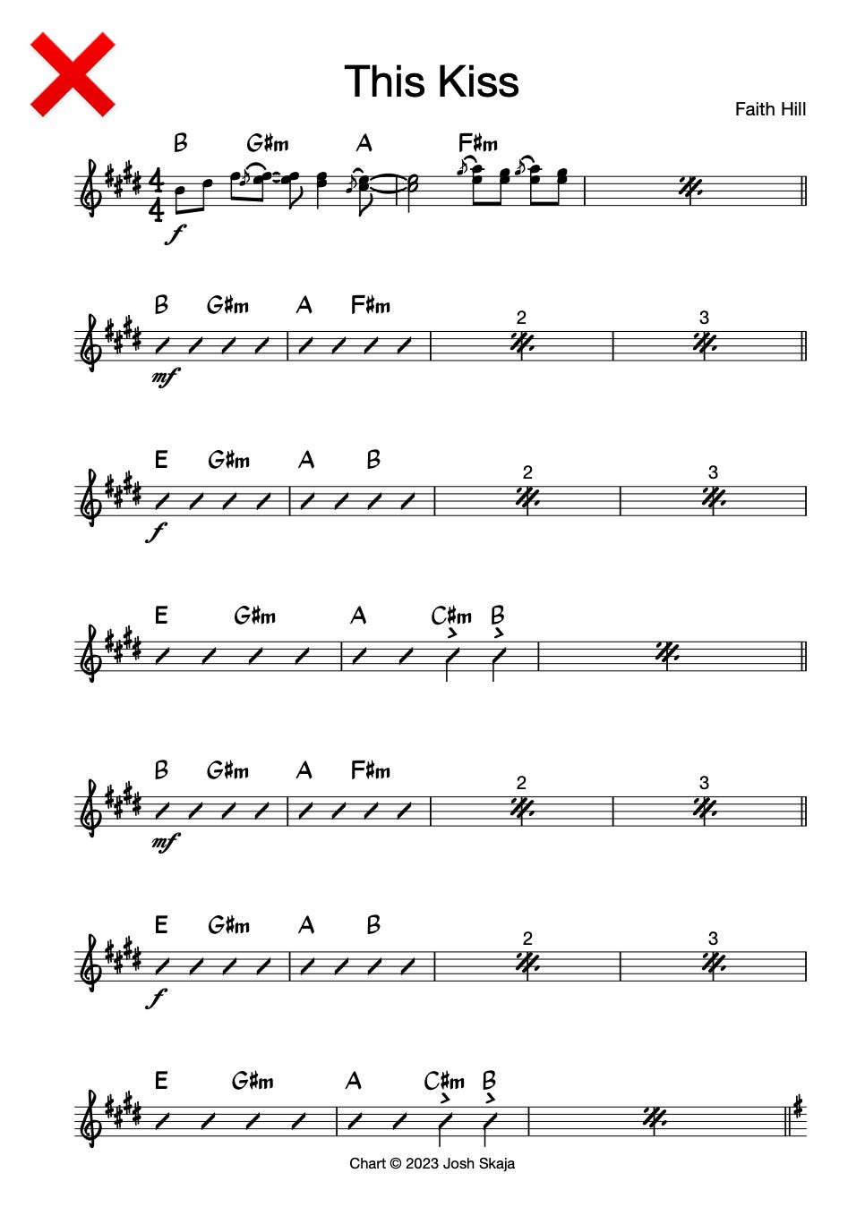
Imagine if we were onstage and I handed this to you:
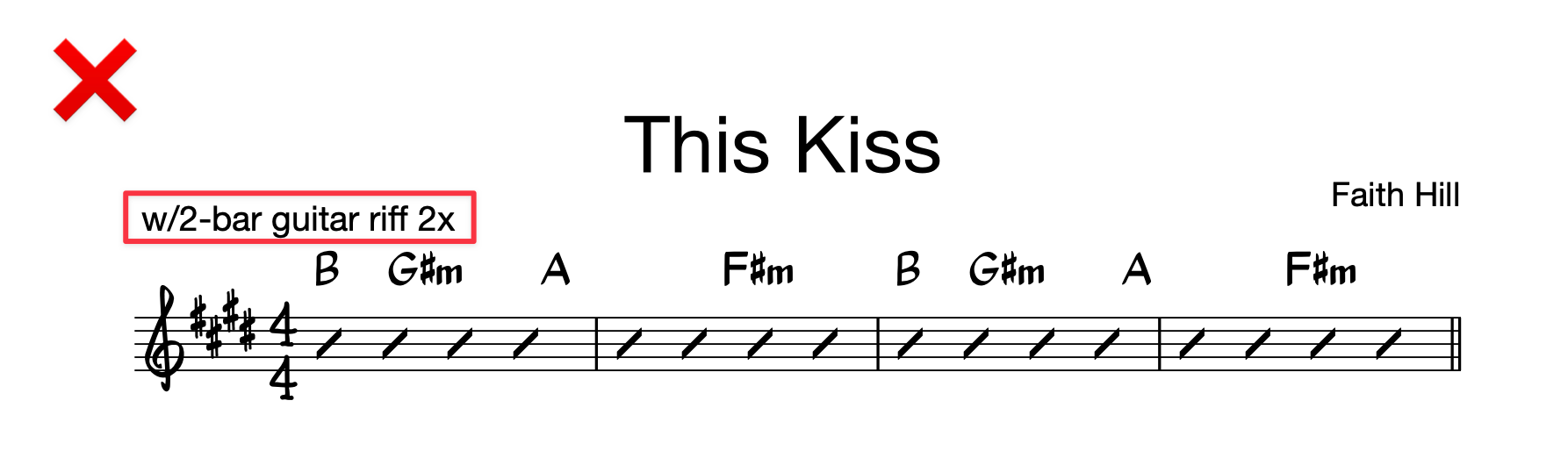
How unhelpful would that be? How likely would we be to play this intro well?
Or what if in the verse I wrote out the exact riff the guitarist plays live, but with no chord symbols, no measure repeats, all crammed into one system:

Choose the right level of detail for the situation!
The wrap-up
We guitarists get all kinds of intimidated by standard notation.
But so much of that is simply because there is a shit-ton of bad sheet music in the world.
A good chart is really just a map.
It should reveal the logic of the song in a way that renders itself unnecessary—it should make it so obvious that you can easily memorize it.
No one is coming to save you.
Bad charts aren’t going away. Better to just learn to create your own.
It’s your world anyway.
Remember, a chart is just a note to your future self. (And maybe your bandmates.) You should write it in whatever way is maximally useful to you.
Your mileage may vary.
Anyway, these are my salty opinions on chart writing. Feel free to take what’s useful, and don’t feel any obligation to stress about the rest.
That’s all I got this week.
See you next Wednesday, when we’ll resume the usual format.
Josh
Thanks Josh, it makes sense now. And appreciate the other tips...seems like I'm going in the right direction.
WRT to figuring things out...I've just started using the Moises app, and it's really great for this (while I develop my ear). You can take any song in your library, slow things _way_ down, and mute the vocals to focus on the guitar. Or mute the guitar to focus on the vocals.
I've tried a lot of this type of app, and this is next level (they claim they use AI).
Great post, as usual, Josh! Some questions:
1. I'm not clear what you mean by a "system", and how that differs from a "section"
2. You don't talk about lyrics here. How do you chart them? Currently, I'm learning to sing as well as play, and phrasing has been a real challenge.
I've gotten a lot of mileage from making my own "chord and lyric" text only lead sheets, and making sure the chords and lyrics line up _exactly_ ... even writing in the count above the words in the most difficult cases.
How do you deal with this in your charts?